Almost all of our clients are real estate bloggers. However, they are not all showcasing their blog articles in the same fashion.
Some put the blog at the forefront of their website’s homepage, while others tuck it back onto a secondary page only accessible by a button on the navigation. Some use sidebar widgets to showcase recent articles, others leave truncated articles on the homepage, just below the fold.
How does one decide how to present blog content to their audience?
What are the pros and cons of showcasing or not showcasing your real estate blog content?
The Front and Center Blog
Placing your real estate blog content on the homepage as the prominent content under the header/navigation is the most aggressive way to showcase your blog.
The blog articles are positioned to be a main impression of your online presence. Whether you choose to blog about market statistics or announce the grand opening of a new ice cream parlor in town, your audience is going to notice. (So are the search engines – but I’ll get to that in a few paragraphs)
If you are a dedicated real estate blogger, and you are using this to your advantage in your marketing strategy then pushing your blog on visitors is a sound approach. But the key to success with this plan of attack is the dedication. If you are not blogging regularly (2-3 times or more a week) then I would consider a different approach.
By putting the blog front and center, you are making a commitment to your audience that you will provide them with relevant and fresh content. Content that is going to bring them closer to doing business with you – because they read and appreciate it. By putting the blog content front and center, you are begging for it to be noticed at the cost of your audience not immediately locating the ubiquitous Search for Homes call-to-action.
If you are unable to keep up a patterned posting pace, the first impression you end up making is a Stale Blog.
A great motivation to maintain a Front and Center blog on your real estate website is the SEO benefit.
The Weight of the Homepage:
Publishing new content onto the homepage not only gets it spidered most frequently and effectively, but it is also giving it more authority. Your homepage is considered the most relevant page on the site (so far as the focus of your site is concerned) and the content that hits this page is going to be given more weight than if it were buried in the secondary.
More Headlines = More SEO
By adding the blog to the homepage you are also showcasing more Heading Tags (H2) there. Headings are given more weight than the rest of the articles’ content.
Truncated vs Full Articles on the Homepage.
If a homepage blog is the answer for you, you’ll need to decide whether or not to showcase full articles or truncated versions, or even a combination of the two.
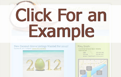 The full article’s greatest benefit is amount of content on the homepage that will be spidered, but it comes at a cost.
If your articles are lengthy, the display of just a few in a row can result in the ‘toilet paper roll effect’ where it just scrolls and scrolls.
Besides the unkemptness, large amounts of content (including images and multimedia) can stall load-times for your site.
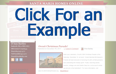 The truncated approach allows for a much tidier appearance* as well as the instant presentation of several articles without the need to scroll too much.
It can be argued that the SEO value is not as strong as the full article showcase, but at some point you need to consider form over function, and I believe this is one of those cases.
After all, the idea is to connect with the visitor and by giving them a broader sense of the range of content you create, you improve your odds of doing so.
*In order to effectively use the truncated approach you need to have this as an option in your design/theme. If you don’t, then you will need to change themes or have one designed to automatically truncate with style.
Pro tip: Place a keyword rich, static, introductory paragraph (or 2) above (or below) the blog articles on the homepage. Include a heading, descriptive text, links to relevant pages and some calls-to-action. Because a regularly updated blog will constantly be changing the content that is on the homepage, this will secure an anchored description for the search engines.
The Blog Headlines Widget in the Sidebar or Footer
 A widgetized website allows you to place a Recent Blog Articles list of headlines on your sidebar or footer (should your theme permit). You can choose how many headlines you want to show and exactly where you want this list to appear.
Some bloggers that have a Front & Center blog will also add a recent article widget to their site. This allows for easier navigation to the content as well presenting a permanent list of articles on all pages of their site.
The 2 main reasons to not showcase your blog articles Front & Center are:
1. The frequency of your posting is not something to showcase.
If you are not writing regularly (at least a couple of times a week, faithfully) then you’ll want to put less emphasis on this fact.
2. The organizational strategy of your site is strong calls-to-action, leaving no room for space hogging blog articles.
Putting the Blog Behind a Button
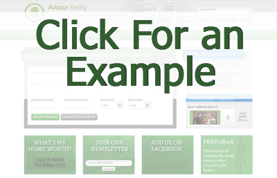
The most inconspicuous way to present your blog on the homepage is behind a header navigation link or call-to-action button.
This works best when the blog is a less relevant element of your site, but not something that you want to bury altogether. Linking to the blog from the homepage ensures that it will be indexed properly.
This can be a great option for those that have blogged a ton in the past, but are burned out and not keeping up with the pace that a Front & Center position demands. Visitors can still enjoy the bank of content without recognizing immediately that you fail to post regularly.
Pro tip: If you are in this position a good trick is to remove the display of the posting date from the articles making it difficult to discover when the posts we published.
Pro tip 2: Under the Blog button list your most popular blog categories in the drop down menu as shown in the example.
If however, you have never been able to keep up any consistent pace of regular blogging and you have just a few dusty old articles, it might be time to remove any exposure to that blog from the homepage.
The Blog Below the Fold
 One final option is to place the blog below the fold (or scroll) – meaning it is not a top tier item nor part of the visitors’ first impression. This strategy allows you to take advantage of having some dynamic content on the homepage without using up real estate reserved for branding and call-to-action.
Typically this approach uses truncated articles as illustrated in the example.
The live examples of the screenshots* presented can be seen here:
TheRealEstateCoconut.com
SantaMariaHomesOnline.com
Hibanism.com
ArbourRealty.com
*Please note that the live example format may no longer match the screenshots in the article.
If you would like to learn more about how to most effectively include a blog on your real estate website, contact us for a free consultation.


