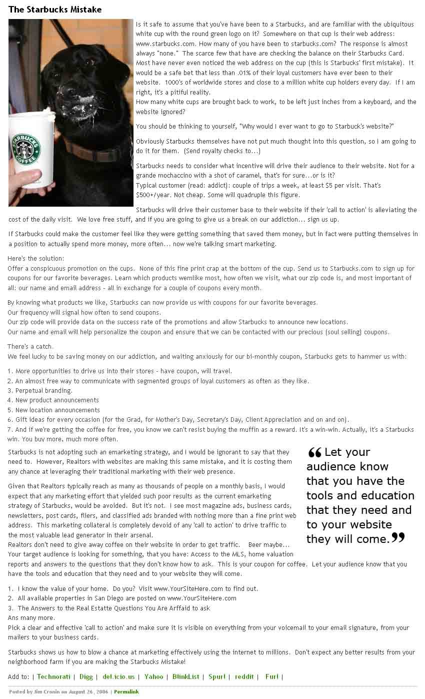
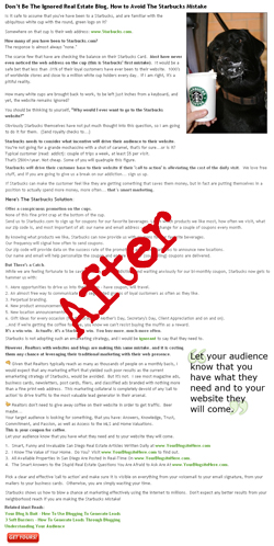
 A year and a half ago I wrote a blog article called the Starbucks Mistake. The article was based on a Talk that I used to give regularly during the e-marketing seminars which I organized before I got into blogging. My blogging style, voice, format and content have noticeably developed since The Starbucks Mistake. I thought it would be fun to make-over the original article to illustrate the changes my blogging has gone through as well as how effective certain formatting techniques can be. Because of the attention that I am drawing to this ancient article, I can’t resist making a few changes to the content… call it “freshening it up a bit”. But for the most part, I am looking to leave the original text alone and focus on improving its presentation, organization, and optimization. (Disclaimer – Things may have changed on the Starbucks marketing front since I originally wrote the article, and the observations may no longer apply.)
- To see the Original Article click the Before image to to the right.
- To see the New Version, click the After image below.
Listed Below: The Edits Made During The Blog Article Makeover
The Headline
- Improved article headline to be more emotional, descriptive, keyword rich and compelling.
The Lead Image
- Aligned Right to drag away from natural left line of the reader.
- Added Anchor Text to image (easter egg) to be more descriptive.
- Added border to the image for a touch of elegance.
- Added more horizontal padding making article seem less crowded around image.
- First paragraph has been broken up into multiple, double spaced lines to draw attention to the impact phrases, and to appear as less of a mental commitment at the start of the article.
- Capitalized the ‘S’ in Starbucks.com
- Added an Anchor Tag Title (easter egg) to Starbucks.com
- Added bold formatting throughout article to the sentences that tell the story; “the killer” lines.
- Dropped many sentences to appear right below one-another to prevent the ‘run-on’ feel, and hopefully avoid it being overlooked so easily by a scanning reader.
- Created a Heading <h3> in the center of the article to break up and draw attention to the message. Because it is a heading, the words will also carry more SEO weight.
- Added link to Starbucks stock profile and included a witty anchor (easter egg).
- Broke up the large paragraph towards the end of the article to avoid it being ignored completely by the scanning reader.
- Updated the closing message to include the marketing of the blogsite so that the article jibes more effectively with my contemporary message.
- Capitalized the first letter in each Call To Action example to improve their impact and visibility.
- Went through the whole article one last time and cleaned up grammar, tenses, minor formatting elements and may have even added a word or two.
- Added Related Must Read section.
Block Quote and Icons
- Added thumbs-down and thumbs-up icons to the two thoughts that previously made up the large paragraph. This was to break up the bolding habit, and draw attention to the emotion of the message. It’s a little cheesy, but I bet it improves its readability.
- Polished the Block Quote with an updated style, and changed the message to be more concise.
- Added the Red Call To Action button that links to our Tomato Inquiry Page.
- Swapped the Social Bookmarking links for the Share This script.
This exercise has inspired me to go through the archives of my early posts and make sweeping improvements to their readability. Hopefully it has inspired you to embrace the techniques you can use to ensure the reception of your message. Keep in mind that the blog reading audience is generally more fleeting than any other type of reader. Bending the rules of English 101 to keep their attention can mean the difference between being understood and being ignored.


