As mentioned in the recent article about using images, we’ve received great feedback during our live reviews of the websites submitted by our free webinar attendees.
I bring it up again, because another common infraction we see during our website reviews is an inconsistent use of fonts.
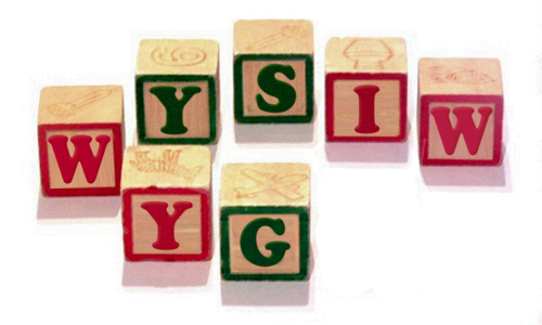
Here are some sound tips on how (and why) to maintain a consistency of font usage as well as how to best take advantage of the font styling tools in your WYSIWYG.
Use the WYSIWYG Editor to Compose Your Articles.
Many beginner bloggers are used to composing documents with tools like Microsoft Word/Works/PPT.
Their first impression of the WordPress WYSIWYG editor is that it is limiting, and it is (this is on purpose, I’ll explain later).
Since the common concern is that there is (seemingly) no way to adjust font sizes in the WYSIWYG, they fall back on tools that they are comfortable with and copy/paste their content back into WordPress. This causes all sorts of issues not the least of which is a lack of uniformity.
The proper way to adjust font sizes in your blog articles is to use the Heading options in the drop down menu (under ‘paragraph’). The only instances where you should have a need for a larger font are in the Title of the Article and when you create subheadings within the article. All other text should remain in “paragraph” form.
Here’s a crash course in using the Heading Options:
Heading 1 – Ignore this for now. This is the main Title of the Page (not the article)
Heading 2 – Ignore this for now. This is reserved for the Title of the Article.
Heading 3 – Use this for Major Breaks in your articles such as each of the 3 items in a 3 item list.
Heading 4 – Use this for breaks between Heading 3s
Heading 5 – If you must… use this for breaks between Heading 4s
Heading 6 – Forget it.
Let Me Introduce You To The CSS Stylesheet
The stylesheet of your blogsite sets the standard for the text formats including font family, sizes, colors, links, and styling. These standards are global, meaning that they are set to be consistent throughout the site, maintaining a uniform appearance. Conform to these established rules and work within the WYSIWYG to achieve the best results.
If you are not happy with the the current font styling on your articles (or any other location on your site) then you’ll need to make changes to the CSS Stylesheet. If you are unfamiliar with CSS, ask a tech savvy friend, or learn from W3Schools (Text and Font).
The Look Of The Text Editor Version Is Nothing Like The Live Article
I admit that this can be a frustration, but it needs to be overcome.
As a blogger, it is crucial that you are comfortable blogging from the WordPress platform. The best suggestion is to regularly preview the article to get a sense of how the live version will appear before publishing. I usually end up previewing an article several times before I publish it to make sure that everything fits properly.
Do Not Copy/Paste Into the Visual Editor
If you must paste content, do so in the HTML editor (see tabs on upper right of WYSIWYG).
By placing it here, you are able to eliminate all formatting from the selection. This avoids the potential inconsistencies you get when bringing content from a different source.
Use Bold/Underling/Italics To Add Stress, Not Color
Cut the crap with all the colors.
I can see using a color to draw attention to a word or phrase, but please, please, please leave it to a single instance. A post full of colored words looks amateur. Respect your content. If you format the article properly, you’ll have no problem adding stress to words and phrases with the standard options.
Similarly, please be conscious to limit your use of the bold/underline/italics. The idea is to draw attention to particularly strong phrases. Trust me, your article is not strewn with impact.
Use The Spell Check
Spelling errors do make you look less intelligent and lazy. With all the spell check options at your disposal, you have no excuse.
Now if they could only provide us with grammar, syntax, context and logic checkers 🙂
If you want to master these techniques alongside a personal trainer, contact us right away to schedule a session.


